Gold prices hold gains as dollar ticks down; US shutdown woes lend support
When the US Treasury yield curve inverts (short rates rise above long rates) the shift is widely viewed as a reliable forecast that a recession is near. But this time has been different, or so it seems. The curve has been inverted since July 2022, the longest inversion on record, but a recession has yet to arrive.
Is the yield curve no longer relevant for business-cycle analysis? Or is this widely followed signal just slow this time? Actually, it’s neither, explains Robert Dieli, an economist at NoSpinForecast.com, a business-cycle consultancy.
In a series of email exchanges with CapitalSpectator.com, Dieli outlines his views on the yield curve, of which he is a veteran analyst on behalf of his clients.
“The last four recessions started after the yield curve inversion was resolved,” he advises. “The signal is not when the curve inverts. The signal is when the curve goes back to its normal shape.”
In the following Q&A, Dieli shares additional thoughts (and charts) on the art/science of interpreting the yield curve for business-cycle analysis.
Q: What set of Treasury yield maturities do you prefer for monitoring the curve?
A: My criterion for whether we have an inverted yield curve is the yield on the 10-year Treasury Note minus the current level of the Federal Funds Rate. In both cases, I use the monthly average of each metric.
I use the Fed Funds rate because the FOMC has complete control over its level and trend, which means that the duration and severity of a yield curve inversion are largely at their discretion. I use the 10-Year Note both because it has the longest continuous issuance history of the long-maturity securities (both the 20-year and 30-year Bonds have had gaps in issuance) and because it is currently the flagship rate in the bond market.
What is the track record for recession warnings for the yield curve when it normalizes after a period of inversion?
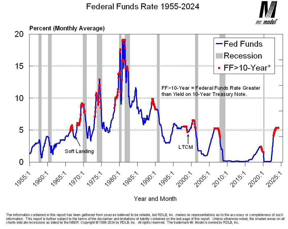
This chart shows the record of yield curve inversions going back to 1955. As you can see, we did not have inversions under my criterion, until the mid-1960s. The next two charts address the question you just posed.

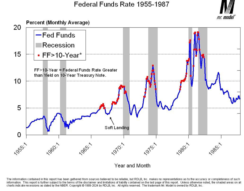
During the period between 1955 and 1987 the curve inversions persisted into the recession periods. Note also that we had a period that I have marked as the “soft landing” where we had an inversion of the curve that was not soon followed by a recession. This was the episode in which the FOMC succeeded in slowing the economy almost to the point of a downturn and then eased policy. History strongly suggests this was a bad move since what followed was one of the most volatile periods of inflation and monetary policy.

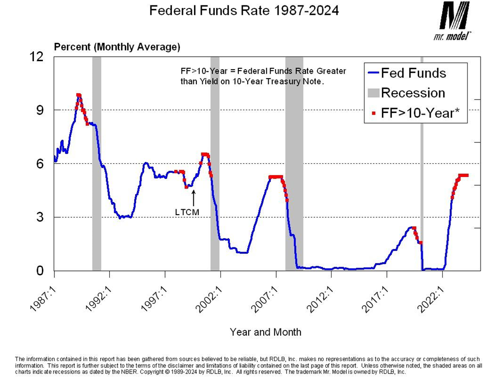
Since 1987, which appears on both charts because Alan Greenspan replaced Paul Volcker at the Fed in August of that year, the inversions have ended either shortly before or shortly after the official business cycle peak dates. Keep in mind the location of those dates was set well after the changes in monetary policy took place. The FOMC did not know exactly where the cycle peaks would be when they changed policy.
The LTCM note on the chart refers to the Long-Term Capital Management failure, which required that the FOMC cut rates as part of the resolution of that crisis. This was not an analog to the soft landing we saw on the prior chart, which was an attempt to regulate macroeconomic activity through monetary policy. LTCM was a rescue and recovery mission.
One final point to note is that through the entire period covered by all the charts, the inversions usually start during periods where the Funds target is rising and always end during periods where the Funds target is falling. Which is another way of saying that the cycle peak signal is when the Funds target begins to fall, not, as some would have it, when the Funds target starts to rise.
What is the yield curve telling us these days about the state of the US economy and the near-term outlook?
Two things. First, the FOMC is applying restraint and is, therefore, expecting to see economic reports that reflect the effects of that restraint. In particular, a diminution of the rate of inflation.
Second, with the FOMC currently in what appears to be the pause phase of its “pause and pivot” strategy, we should be alert for the signals that will tell us they are satisfied as having applied enough restraint and thus begin to pivot.
Is the yield curve alone sufficient to monitor business cycle risk? If not, what other indicators are on your list and what are they telling us at the moment?
It would be nice if there was just one indicator we needed to follow to monitor business cycle risk. Unfortunately, such is not the case. The yield curve is attractive for many reasons. First, the data are available in real-time. Second, the data are never revised. Third, it is simple to calculate regardless of which set of interest rates you use. Fourth, it is sufficiently arcane to allow you to sound smart. But it is not enough by itself.
I have three other metrics that I look at along with the yield curve.
The first is the year-over-year percent change in the Index of Industrial Production, which is published by the Federal Reserve and is part of the package used by the Cycle Dating Committee of the National Bureau of Economic Research, the official arbiter of dates for business cycle peaks and troughs. While manufacturing does not play as large a role as it did back in the day, the health of that sector correlates very strongly with the overall health of the economy.
The second is the six-month moving average of the year-over-year-percent change in private payroll employment. (Say that fast six times!) That series has dipped below 1% in front of every cycle peak. Right now, it is running at about 1.6% and has been in a downtrend for the past year.
The third is the spread between the inflation rate and the unemployment rate. As we have approached cycle peaks in the past, the inflation rate has gone above the unemployment rate ahead of the cycle peak. We have that condition present today.
Having an inverted yield curve, flat manufacturing activity, slowing employment growth, and an inflation rate higher than the unemployment rate suggests a level of instability that would facilitate the formation of a business cycle peak. Whether we get one will depend heavily on how, when, and why the FOMC executes its policy pivot.
