Is this U.S.-China selloff a buy? A top Wall Street voice weighs in
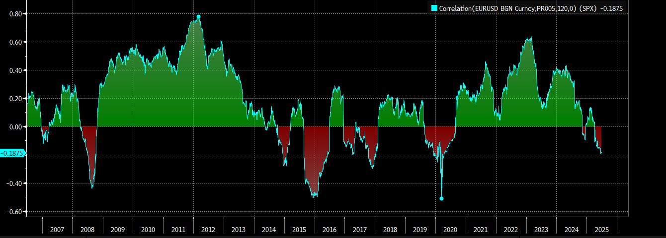
I think this is the most important macro chart in the world right now.
The chart shows the 120-day rolling correlation between EUR and SPX.
This is a key correlation for big asset allocators such as non-US pension funds: when a European pension fund buys US assets, it is implicitly taking a view on EUR/USD and therefore the correlation between the currency (EUR) and the asset they buy (SPX) is very important to watch.
As you can see from the chart, this correlation has been mostly positive for the last 20 years.
This means that every time the SPX went down, the EUR went down too - and therefore, hedging the EUR/USD risk embedded in their SPX purchase was not an effective strategy.
In other words: the US Dollar exposure served as a great hedge during risk-off moments for the US stock markets.
There were only a few periods when this correlation didn’t hold:
- The early phase of the US-led GFC in 2008
- The surprise gigantic ECB QE announcements in 2015-2016
- Summer 2019 with Bunds at -75 bps in yield
- Today...
All of these correlation breaks were temporary and required some outlier macro events. Correlation reversed quickly to their ’’normal’’, and therefore today we live in a world where foreign asset managers are effectively under-hedged.
This means they are running a huge, huge long USD position...
...right when correlations are starting to break again.
This could require some multi-trillion hedging flows.
Which means a lot of USDs to sell to the market.
Are you watching the USD weakening trend?
***
This article was originally published on The Macro (BCBA:BMAm) Compass. Come join this vibrant community of macro investors, asset allocators and hedge funds - check out which subscription tier suits you the most using this link.
