Eos Energy announces stock offering to fund convertible note buyback
If Congress can’t come to a budget resolution in the next 24 hours, the government will shut down. Sound familiar? We have become numb to the prospect of a government shutdown because it occurs so frequently.
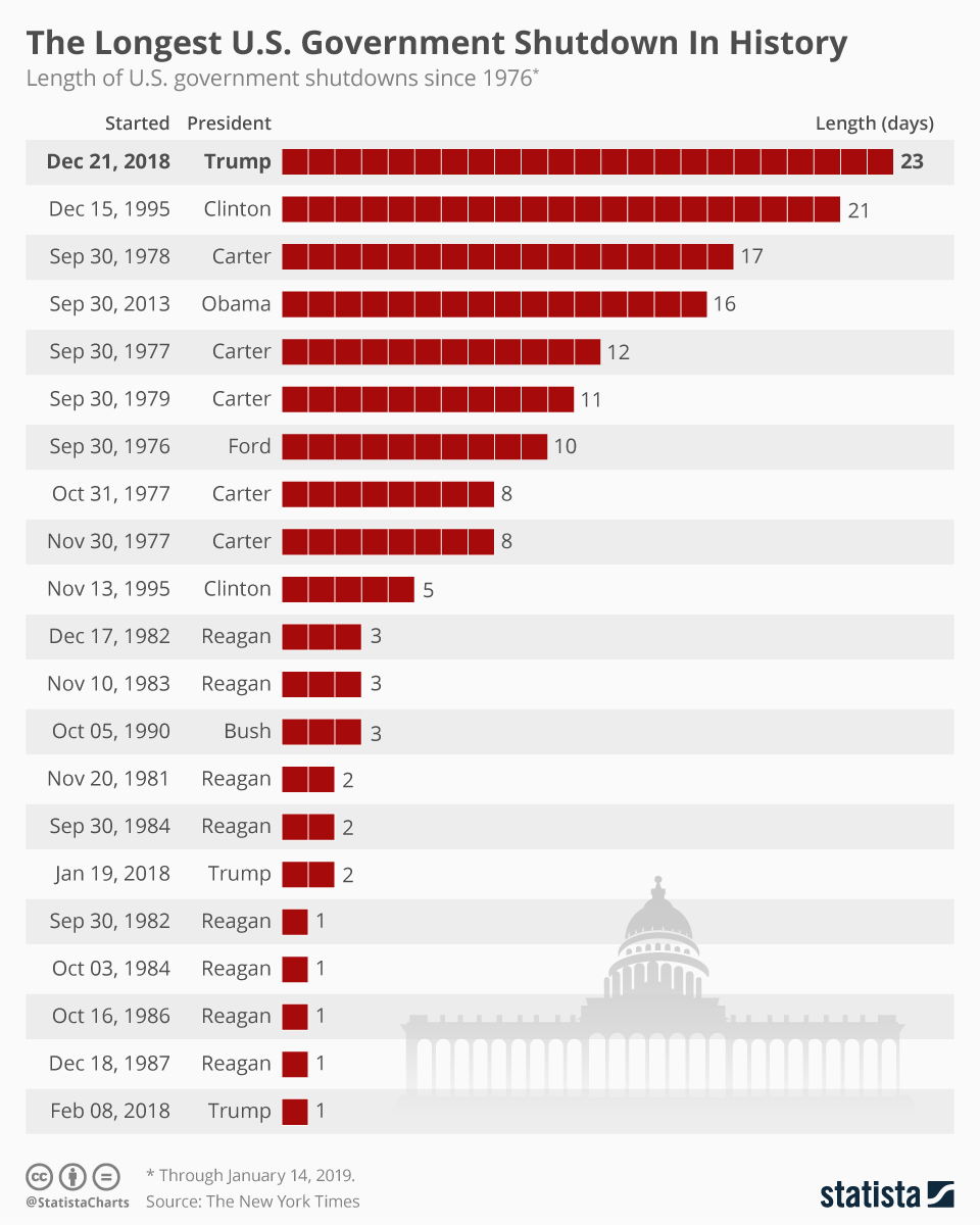
Most often, continuing resolution bills are agreed upon before a shutdown, thus enabling the government to continue operating. In all but three of the last 47 years, a continuing resolution bill has provided “temporary” funding. 1997 was the last year that Congress actually agreed upon a budget. The graph below, courtesy of Statista, illustrates the 21 instances of government shutdowns that have occurred since 1976.
The media is once again making a big deal about the potential for another government shutdown. While a government shutdown may have negative consequences for government workers and employees working in industries closely tied to the government, the economic impact is likely to be minimal.
This is especially true if the shutdown only lasts a few days. However, as we share in the Tweet of the Day below, the BLS will not release the employment report if the government is closed.
From a stock market perspective, the 21 shutdowns shown below have had a negligible effect. In fact, on average, the S&P 500 has gained 0.5% during shutdowns since 1976. The most recent, in December 2018, was the longest on record. Yet it also had the highest stock market return at 6.9%.
Of the 21 instances, the maximum loss over the shutdown period was 3.4% (October 10, 1976). Moreover, 71% of the cases posted a positive return. If this instance is like the others, investors should not fear a shutdown.

Bad Breadth In Context
In yesterday’s Commentary, we noted the market’s bad breadth as follows:
Furthermore, breadth remains weak, with only about 49% of S&P components above their 20-day average and only 56% above their 50-day average. With markets consistently hitting new highs, the breadth should be much stronger. Negative divergences continue in momentum and relative strength oscillators (RSI, MACD), hinting at waning upside pressure.
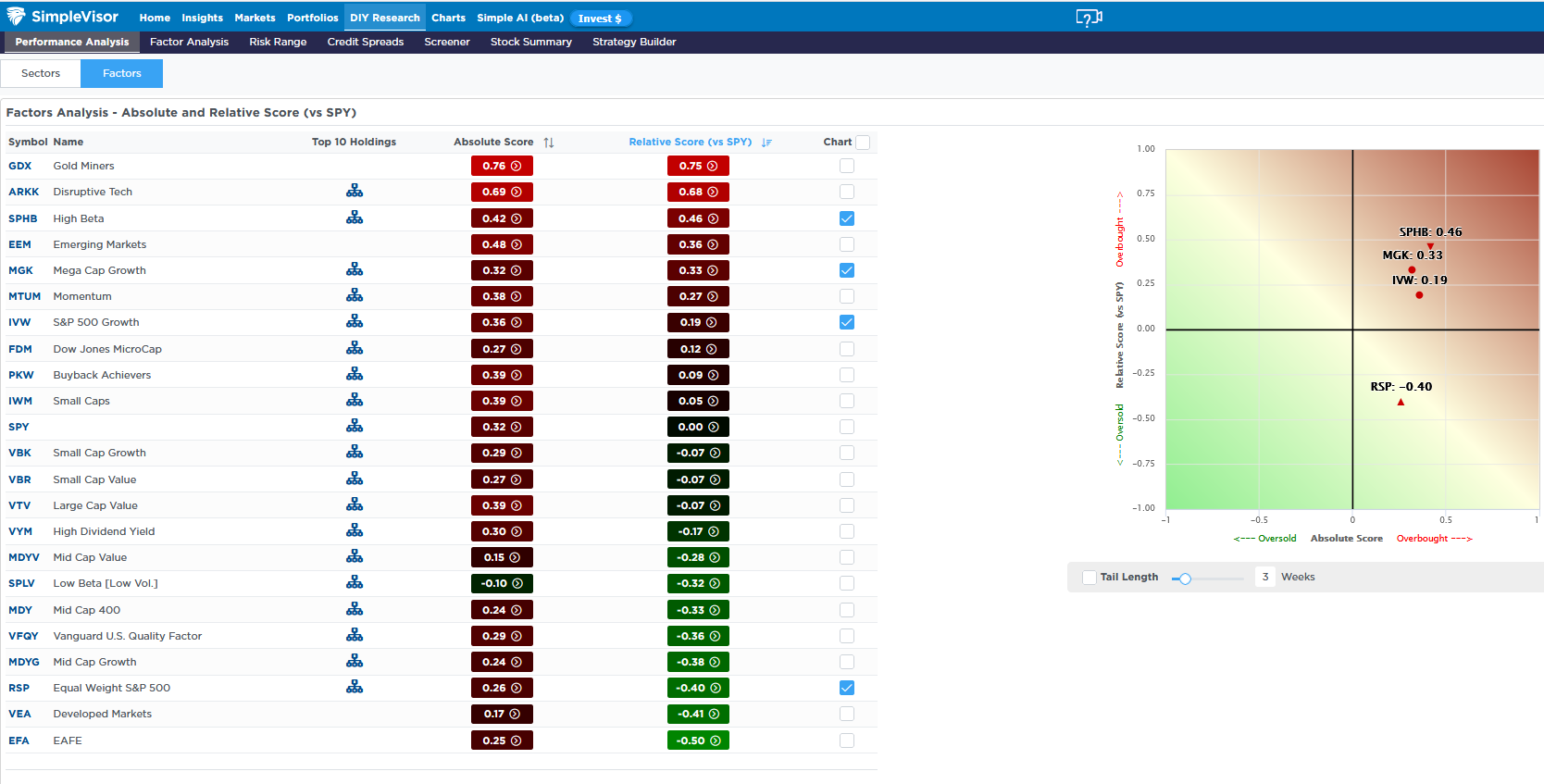
Further evidence can be found in the relative analysis tool. Note that in the first graphic, the S&P 500 equal-weighted ETF (RSP) is the third most oversold factor. At the same time, the S&P 500 growth, mega-cap growth), and high beta). They are among the most overbought. For context on the relationship over the last year, we have shared two more graphics.
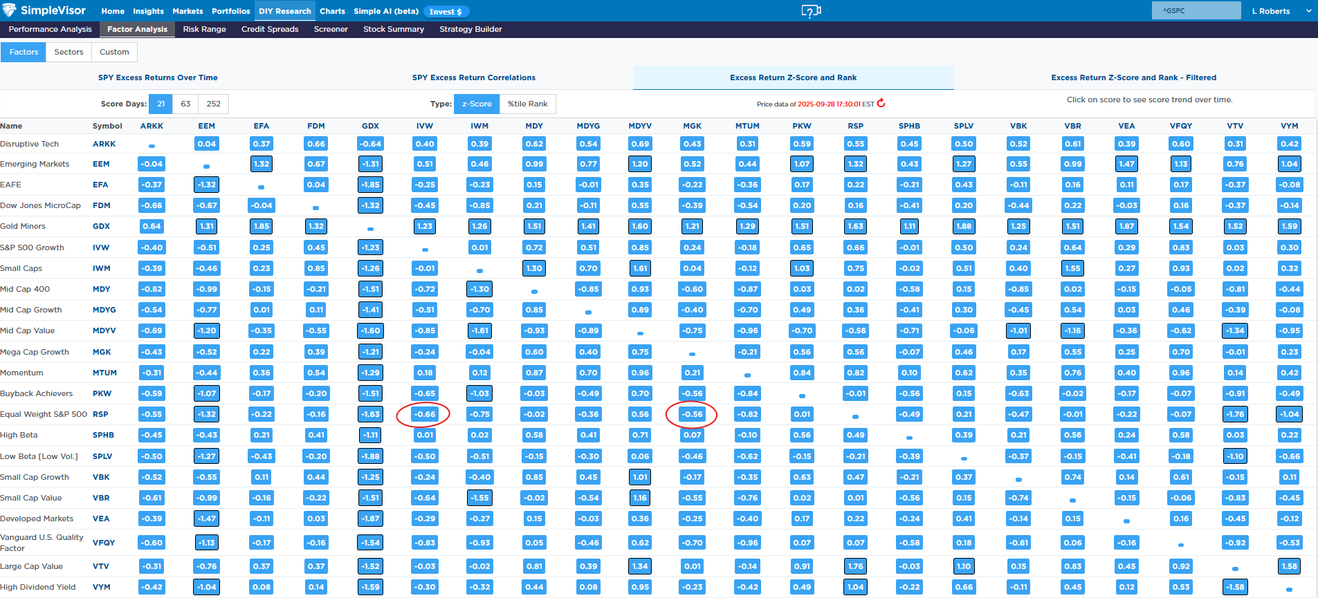
As we highlight, the second graphic shows that the correlation between the excess returns of RSP and the mega-cap and large-cap growth ETFs is running negative and at about half to two-thirds of one standard deviation below normal. In other words, the relationship is not average, but neither is it statistically lopsided.
The third graphic displays a graph illustrating the correlation’s position relative to all other instances over the past year. As we circle, it is in the lowest 25% of instances. This does point to bad breadth, but the market has certainly seen worse over the last year.


Tweet of the Day

