Gold has topped $4,200. Here’s why Yardeni thinks the rally could go even higher.
The seasons are changing, but in ways you might not expect, and this is a good opportunity to think deeper on seasonality AND strategy...
You can almost feel it in the air — the seasons are starting to change.
And I don’t just mean the weather.
Although you might say this week’s chart *is* about the weather (of markets!)
We’re talking seasonal price patterns… but before you hit delete on this, please note: today’s chart does offer a truly different perspective on things.
I’m sure by now you’ve seen dozens of stock market seasonality charts (including from myself over at the Weekly ChartStorm!) — but I’m here today to tell you about how pervasive seasonal trends are across asset classes, and how there’s a bit more to using seasonality signals than you might think...
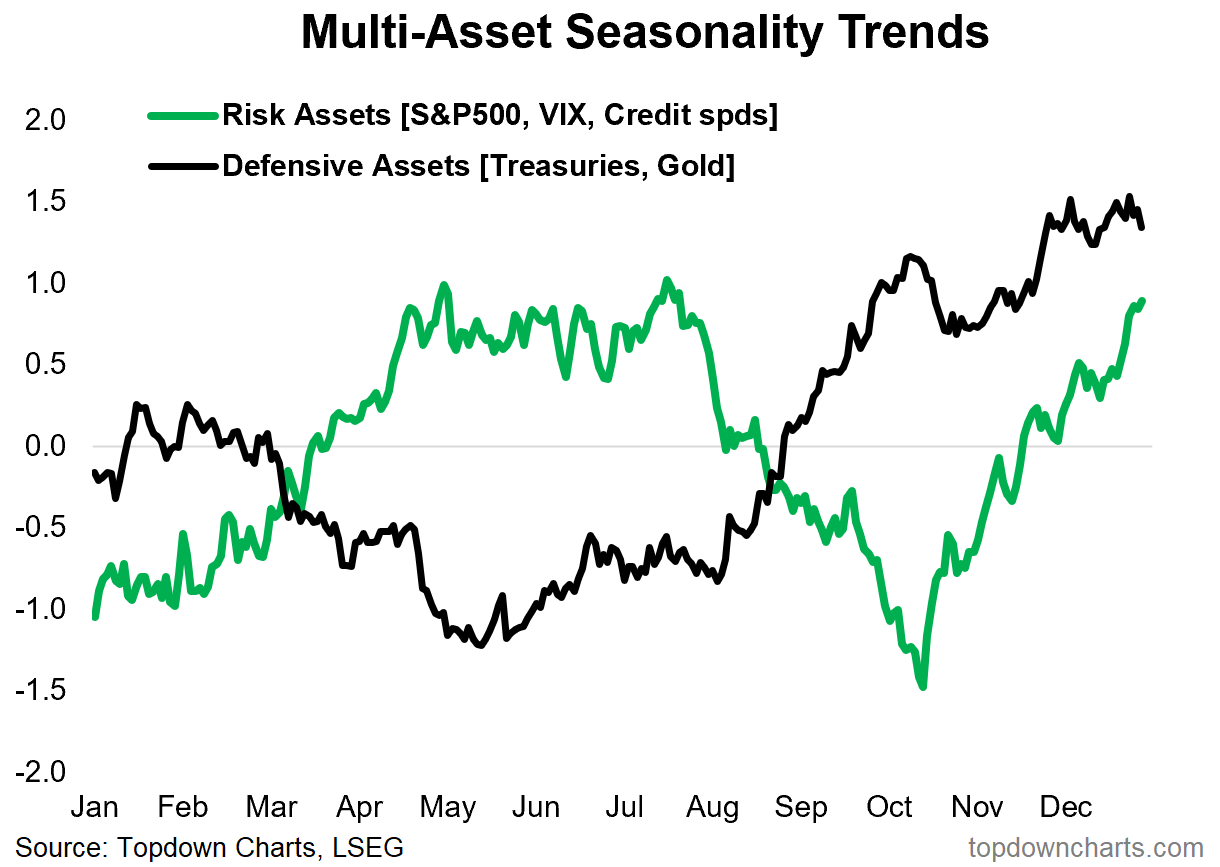
Long story short, we see a clear tendency for: downside in risk assets, increased volatility, and upside in defensive assets right around this time of the year.
That means, if we knew nothing else, and there was no other information… all-else-equal over the Sep/Oct period you would want to have a preference for defensive assets and a bearish bias on risk assets.
That’s the short story.
But let’s consider some nuance on this.
Firstly, what even is seasonality?
It’s very simply an average of price movements across the calendar year, over a period of history (most often calculated using the maximum/longest available historical data).
In that sense, it is a statistical description of what happened in the past (clue 1) —on average (clue 2).
There are a couple of reasons for care and thoughtfulness here: the first clue is that it’s about what happened in the past… and we can look at the past, learn from the past, try to draw inference from the past, but today’s history is still being written. Things can change.
The other thing is, we’re dealing with averages here, and averages contain outliers, but also, if it is actually close to normally distributed, then we know that about half of the time the experience was better and half the time it was worse than the average.
What does this mean?
It means, understand and be aware of seasonal tendencies, but don’t rely on them… AND — Know how to incorporate them into a coherent process.
I always say you should look at seasonality from 2 specific angles:
1. Prompting Information: as a prompt to look closer (e.g. right now we would be paying particular attention to anything that confirms the seasonal trend such as worsening macro data, technical risk flags, value/sentiment extremes) — in other words, if the seasonality says watch out for downside risks, then you’d pay more attention to risk management and look for warning signs and bearish setups; or
2. Confirming Information: as a piece of confirming or conviction building evidence upon an existing and sound thesis (e.g. if you were already tactically bearish on risk assets or bullish on defensive assets, you would be looking at today’s chart as something to build on that existing case and maybe raise your conviction —and thereby lower threshold to action or increase sizing).
So by thinking it through a little further, we can actually dig into some of the most fundamental principles of market analysis and investment strategy. So it’s a whole lot more than just fun with charts and stats.
Ultimately, though, if I managed to make you ponder on process and strategy today (as well as the actual chart), then I can count this as a decent post.
Key point: Seasonal crosswinds are coming to a head across asset classes.
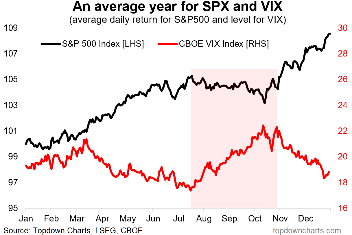
Bonus Chart 1 — Stock Market Seasonality Map
For completeness, here’s the stock market seasonality map I mentioned.
As you can see, it’s around this time of year that price tends to be more ranging and volatile with a tendency for downside in stocks and chance of volatility spikes.
But also — let’s not forget about the good old YER [Year-End Rally]. As far as upside opportunities go, maybe the best thing that could happen would be a nice healthy seasonal correction to set up for a YER to close out what has already been an eventful year…

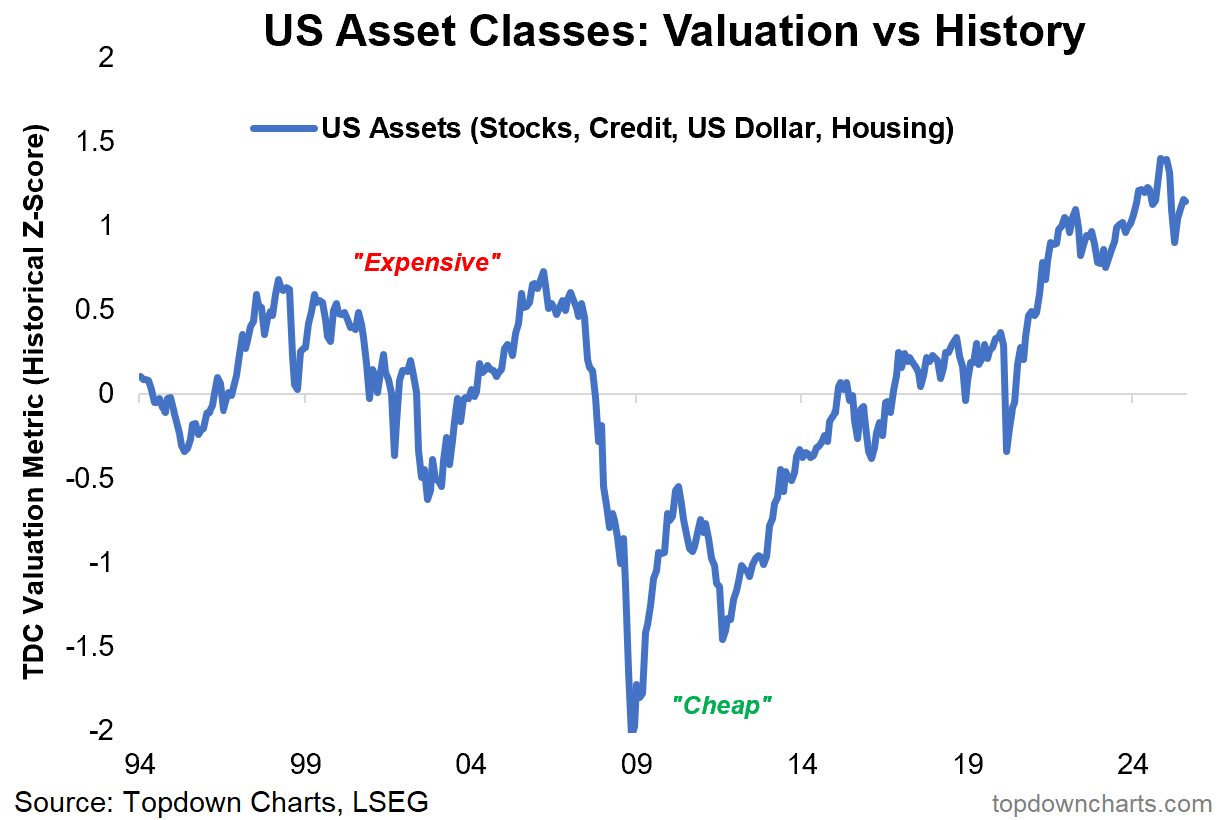
Bonus Chart 2 — Pressure Points
Now to lean a little further into the bearish side and examine the “what could go wrong?“ aspect (and p.s. I also like to ask and challenge people to think of the opposite question: “what could go right?“ you always see people dooming it up for engagement on social media with the first question, but rarely the second).
The key thing that could go wrong, and not just tactically/short-term, would be that we get a typical seasonal spike in volatility and significant sell-off in risk assets… arising at a time when US assets are collectively still trading near record highs (and higher than both the dot com bubble peak + subprime credit boom peaks).
There are very clear pressure points that could get triggered off if the right (wrong) combination of things were to happen.
I’m not trying to call a bubble top or peak or anything, but I think we need to be conscious of these critical background features and realities of today’s markets — both on a larger long-term cycles standpoint, and in the more immediate tactical seasonal swings aspect.
It’s about pragmatism.

