China’s Xi speaks with Trump by phone, discusses Taiwan and bilateral ties
An email from a reader of ours led with the title “PCE is quite confusing.” He asked if we would explain the difference between the monthly PCE prices index and the quarterly PCE prices, i.e., the GDP deflator, accompanying the GDP report. Given the importance of monthly PCE prices to the Fed and their meeting tomorrow, it’s worth answering the question publicly.
Last week, we learned that the quarterly PCE price deflator was up 3.7% on an annualized basis. However, monthly PCE prices were flat. While the two inflation measures share the same name, PCE (personal consumption expenditures), they measure different things.
Monthly PCE prices, the Fed’s favored inflation gauge, track price changes in consumer goods and services. The quarterly PCE price gauge is an index designed to subtract the impact of inflation from the GDP figure to arrive at real GDP. Accordingly, the deflator uses a broader measure of goods and services, including items not directly tied to household spending.
Of additional consideration, the quarterly PCE is more prone to large revisions than the monthly data. Thus, the monthly reading is more reliable. The graph below shows that the two inflation gauges track each other well on an annualized basis.
However, there is a slight gap at the moment between them. While month PCE prices fell by 0.04% last month, they were up .44% and .30% in the prior two months.
Thus, its quarterly annualized change is approximately 3.1%, not as much of a divergence as the recent PCE data portends.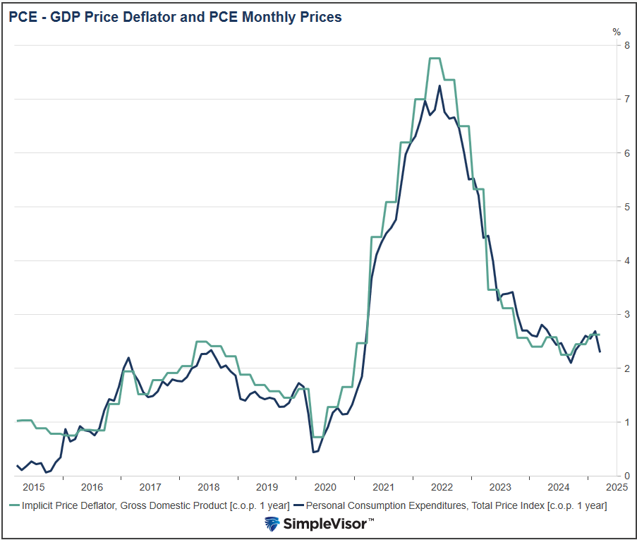
What To Watch Today
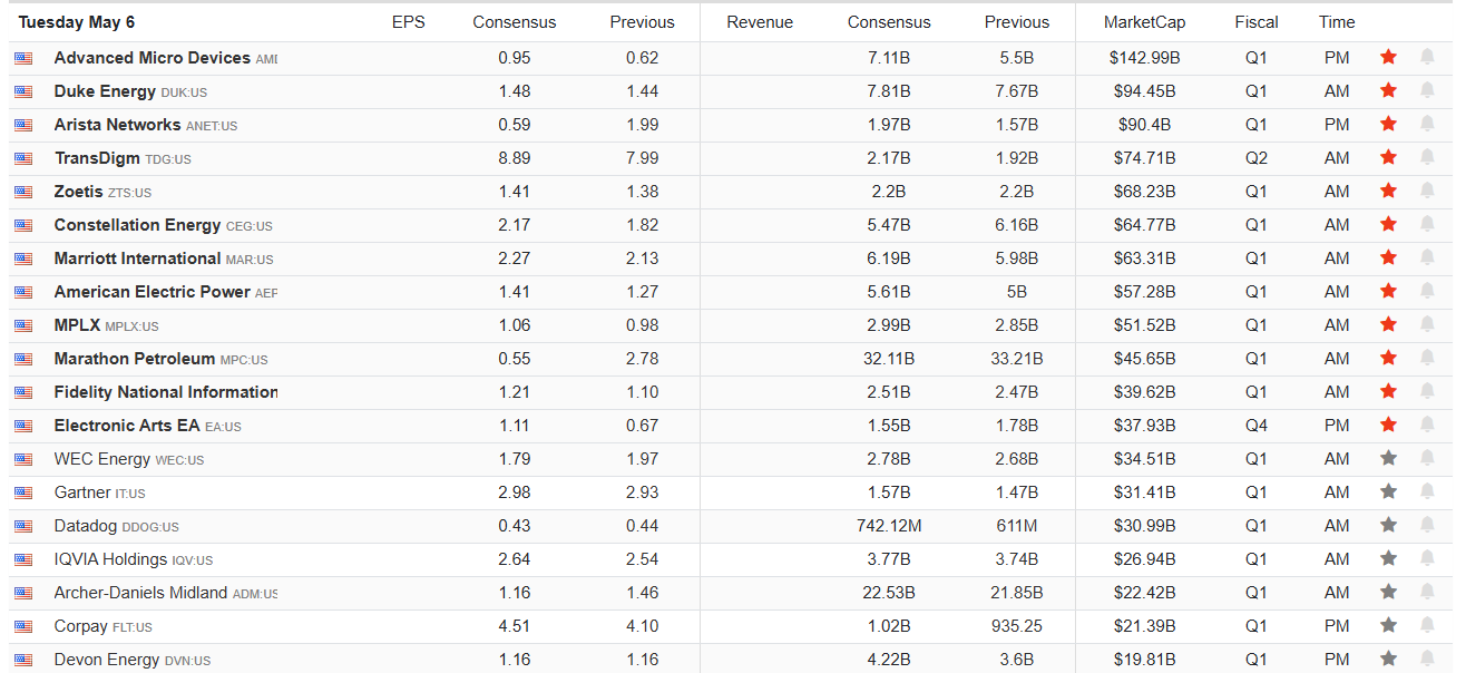
Earnings
Economy

Market Trading Update
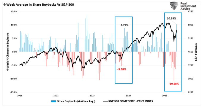
Yesterday, we noted the recent technical setup suggests a near-term correction after a sharp rally from the “Liberation Day” woes. Despite the short-term overbought conditions, corrections will likely remain contained above recent support levels for a couple of reasons. The first, as noted on “X,” the share repurchase (stock buybacks) window has now reopened, and the sharp rise in buybacks has provided the necessary support for the recent rally. Those buybacks will continue through May.
Secondly, the breadth of the market has improved markedly. As shown, market breadth has improved significantly with the number of stocks trading above their 50 and 200-DMA rising sharply, and the NYSE Advance-Decline line testing previous highs.
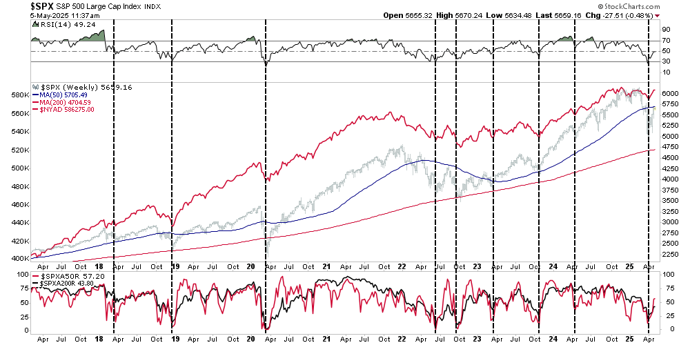
This data suggests that while corrections are likely, they should be well contained to previous broken-resistance levels, turning them into support. The weekly sell signal in the bottom panel is one thing to watch closely. When that signal reverts to a buy, it will be time to return equity exposure to target weights. For now, while a correction back to recent lows is possible, the higher probability is that any correction that reverts the market toward 5500 or 5300 will likely find buyers willing to step in.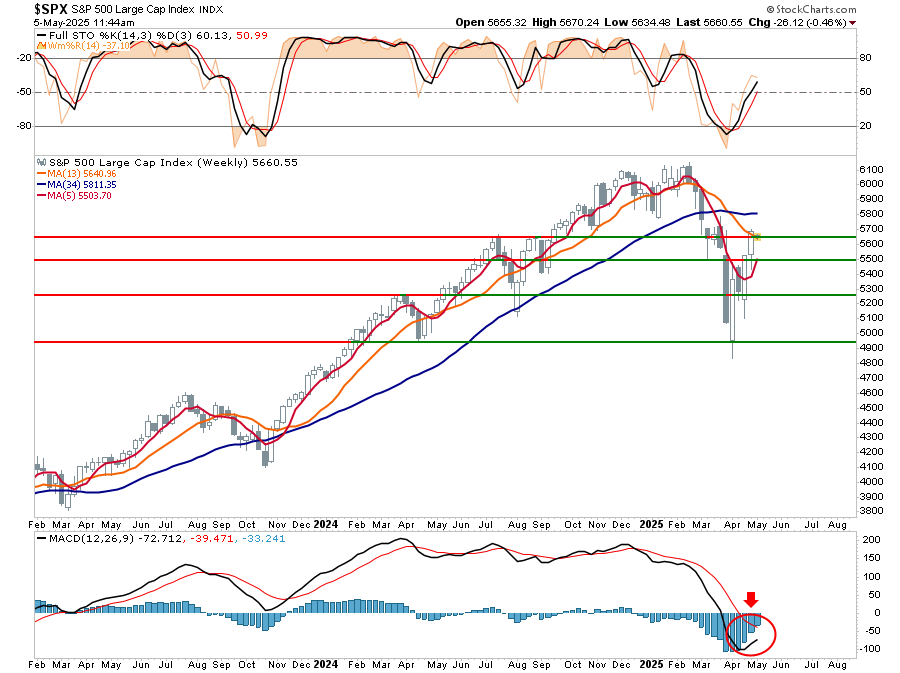
However, with that stated, it is certainly possible that later this summer, as the impact of tariffs is fully recognized, the economy slows, and earnings are revised lower, the market will likely encounter another volatility spat. As I noted in yesterday’s blog on “Resistance Is Futile:”
If you want my best guess, here it is:
- We’ve likely seen the market lows for this year.
- We’ve likely seen the highs as well.
Navigating a market trapped between support and resistance becomes emotionally challenging. Investors face sharp rallies into resistance — and retracements back to support — wearing down sentiment until mistakes happen.
Therefore, this is how we are positioned in this current and uncertain market environment.
- Primarily long equities, as the market structure remains bullish.
- Increased cash levels to manage policy and growth uncertainty.
- Short S&P 500 index to hedge downside risk.
We also recommend a healthy portfolio and risk management regimen.
- Tighten up stop-loss levels to current support levels for each position.
- Hedge portfolios against more significant market declines.
- Take profits in positions that have been big winners.
- Sell laggards and losers.
- Raise cash and rebalance portfolios to target weightings.
Here’s the hard truth: you can’t measure risk in advance.
Sectors Rotate Down And To The Right
Within the first screenshot below, the graph to the right of the sector absolute and relative analysis charts the movement of each sector score over the last two weeks. Interestingly, we notice that many sectors’ paths have moved down and to the right. Consequently, the absolute scores are increasing for those moving in that direction, while the relative scores generally decrease. In other words, most sectors are seeing their technicals improve but are underperforming the market.
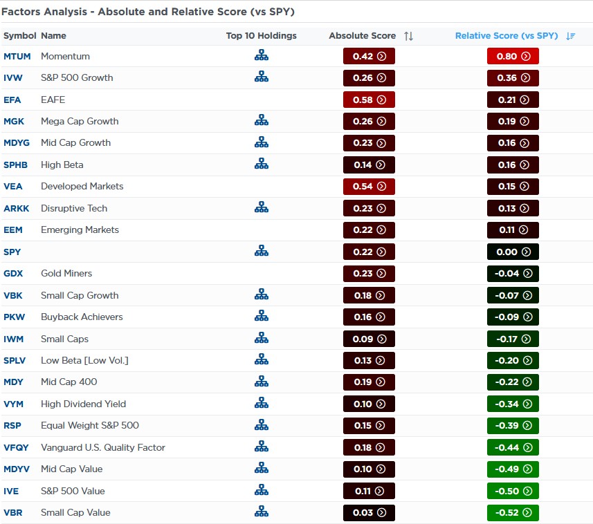
The second graphic shows that despite the decent rally over the last few weeks, many absolute and relative scores remain near fair value. Typically, we would expect to see higher absolute scores. This is a sign the market remains cautious. However, if the market continues to rally, there remains a decent amount of upside before sectors and factors become overbought on an absolute or relative analysis.
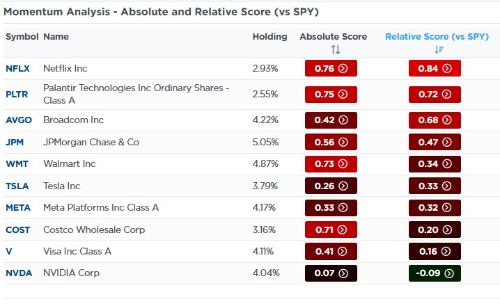
The second graphic shows that the Momentum ETF is very overbought versus the S&P 500. The third graphic breaks down its holdings. As you can see, some of its largest holdings are decently overbought on an absolute and relative analysis.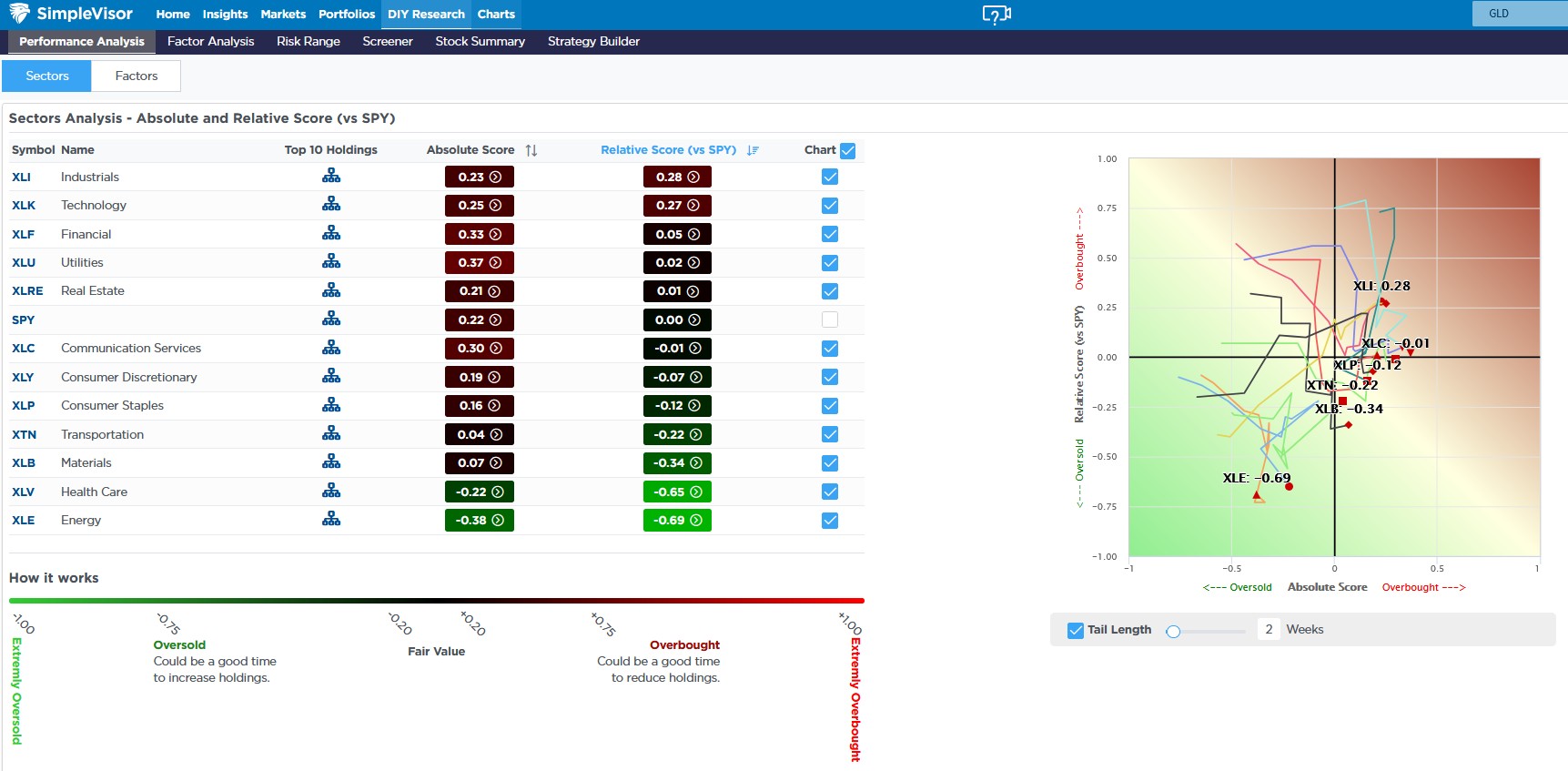
Tweet of the Day
